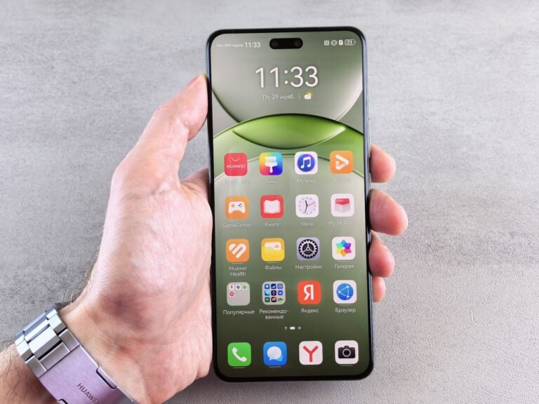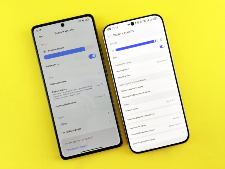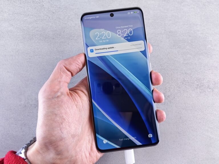

A phone’s glass can run nearly to its frame, while an Android app surface can extend beneath system bars. Your phone may have thin borders, while an app background runs behind the clock and gesture area. Neither meaning describes a setting you need to activate.
You’ll see where phone-design language ends, where Android layout behavior begins, and how Android 15 exposes spacing faults in poorly updated apps.
Two Uses Describe Hardware and App Layout
The same phrase appears in phone marketing and Android development, yet each use points to a different part of your device. Hardware language describes the physical panel near the frame. Android language describes an app canvas that reaches behind the status bar and navigation bar.
Thin screen bezels raise the visible screen-to-body ratio. A black border still remains around the panel because a phone needs wiring, adhesives, sealing, structural support, and protection against side impacts.
Hardware Refers to the Physical Panel
On a phone, the consumer meaning covers the glass, display panel, and outer frame. Your screen may reach near all four sides while retaining a slim outline, rounded corner, speaker slot, or camera opening.
Consider a six-inch phone playing a wide video. Thin borders make the picture feel less boxed in, though the image still stops around a front camera and curved corners. That visual effect is what phone makers mean in hardware descriptions.
Android Refers to the App Canvas
Within Android, an edge-to-edge Android layout lets an app draw its background behind the status bar at the top and the navigation area at the bottom. You may see a photo, color field, map, or scrolling surface continue beneath those system controls.
The app does not gain control of those regions. Android still places the clock, notification icons, gesture handle, and navigation controls above the app, so your text and buttons need clear space around them.
| Meaning | What reaches the edge | What you see | Action required |
|---|---|---|---|
| Device hardware | The physical display panel | Thin screen bezels | You choose nothing in settings |
| Android layout | An app drawing area | Background beneath system bars | Developers account for safe spacing |
Neither meaning requires an app named Edge. Your phone does not need an “Edge” utility to make the panel larger, and an app that draws under system UI does not receive special access to your device.
That shared wording becomes confusing when physical screen design is mistaken for an app’s drawing behavior.
Thin Bezels, Curved Glass, and Display Cutouts Shape the Screen
That narrow outer border explains why “bezel-less” is loose marketing language. A bezel-less phone still has a physical boundary; the label describes how close the active panel sits to that boundary.
Screen bezels serve several jobs around the panel. They hold display circuitry and adhesives, leave a resting strip for your fingers, and reduce exposure along the edge during a side impact.
Curved Edges Change Appearance More Than Screen Area
Curved-edge glass bends the visible surface toward the side rail, making an image appear to spill over the phone. Waterfall displays push the curve farther, but flat glass can also sit close to the frame.
Your choice between flat and curved hardware affects glare, grip, reflections, and edge distortion more than the label itself. A flat panel can still look nearly borderless while keeping text closer to a consistent viewing angle.
Notches and Punch Holes Reduce Usable Space
A notch, punch-hole camera, earpiece, proximity sensor, or display cutout interrupts the full rectangle available to an app. The panel remains large, but a title under a punch-hole camera can look clipped or crowded.
Rounded corners produce a quieter version of the same limitation. Your app cannot rely on every pixel in the outer rectangle because corner curves and cutouts can cover part of a button, icon, or line of text.
| Feature | Effect on appearance | Effect on usable content |
|---|---|---|
| Thin bezel | More screen reaches the frame | Little direct loss of app space |
| Curved glass | Side imagery appears to wrap | Side text can distort or catch glare |
| Notch | Top edge appears interrupted | Top controls need added clearance |
| Punch-hole camera | Small circular opening in the panel | Icons and headings need careful placement |
An edge-to-edge display is not the same as a curved display. Thin bezels describe border size, curved edges describe glass shape, and cutouts describe portions of the panel occupied by cameras or sensors.
Those design choices increase visible area while reducing the margin available for comfortable touches.
More Visible Screen Brings Practical Trade-Offs
A narrow frame changes how a phone feels in your hand. Maps, films, book pages, and split-screen workspaces can appear broader without making the handset physically wider.
Video benefits where the image fills more width, while games gain a less restricted field of view. Your eyes still register cutouts and rounded corners, but less black border removes part of the old window-frame effect.
Screen Proportion Shapes Visual Impact
- More visible image Your display occupies a larger share of the device front, making photos and video feel less confined.
- Wider reading area A slim border leaves more room for text without forcing a wider phone body.
- Cleaner split screens Multitasking panes feel less cramped where the panel reaches closer to the frame.
- Continuous artwork App colors and images can run beneath system bars instead of stopping at a hard band.
Those visual gains put pressure on hardware design. Less border area leaves less room for front-facing speakers, cameras, infrared hardware, and touch-rejection components. Your phone maker has to move those parts, shrink them, or place them under the panel.
Curved Sides Add Touch and Glare Problems
Side curves catch room light at sharp angles and can produce bright reflections. Text near the far edge can bend visually, and your thumb can trigger an accidental touch while you hold the phone.
Keep tappable controls away from extreme side edges on curved phones. A button that looks fine in a flat-screen mockup can sit beneath your palm during normal use.
That need for protected touch space carries into Android layout behavior. A background can extend to the edges, but controls need a safer landing area.
Android Layout Extends Behind Visible System Bars
A modern app can paint beneath the clock without covering the clock itself. Android places system bars above the app layer, while the app chooses whether its own surface stops below them or continues underneath.
Older Android screens commonly began below an opaque status bar and ended above an opaque navigation bar. In a modern layout, a blue header image can continue under the time while its title begins lower, where your eye can read it clearly.
System UI Stays Above App Content
| Mode | System bars | Typical use |
|---|---|---|
| Edge-to-edge layout | Visible above app content | Daily app screens and scrolling views |
| Immersive mode | Temporarily hidden | Video playback and focused games |
| Full-screen mode | Reduced or hidden for a task | Camera previews and media views |
Immersive mode and full-screen mode hide parts of the system interface for a period of time. Edge-to-edge retains the status bar and bottom controls, so you can check time, alerts, and exit gestures without revealing them again.
Overlays Use a Different Permission
“Draw over other apps” lets an app place a separate window above another app, such as a chat bubble or accessibility tool. It is not the same as drawing behind your own system bars.
Your app can draw beneath its own system UI without overlay access. The distinction matters because overlay access affects what appears above separate software, while Android system bar handling stays inside the app already open on your screen.
Once content reaches the edges, its interactive elements need boundaries that the background does not.
Safe Areas Protect Text, Buttons, and Forms
A background photo can run behind a display cutout, but a search field cannot. Safe areas mark regions where essential text, buttons, and form controls remain clear of system bars, rounded corners, cutouts, keyboards, and touch zones.
Android exposes those boundaries through WindowInsets. Your interface receives live measurements for occupied top, bottom, and side space, then uses those values around elements that need protection.
Backgrounds and Controls Need Different Spacing
Let wallpapers, gradients, maps, and media extend through the full canvas. Then add content padding to a toolbar title, floating action button, message composer, or checkout control so your finger can reach it.
A chat app shows the pattern clearly. Your conversation background can continue behind the gesture handle, while the text-entry field sits above that area and rises again after the keyboard opens.
| Screen element | Can extend beneath system UI | Needs inset padding |
|---|---|---|
| Photo background | Yes | No |
| Toolbar title | No | Top padding |
| Bottom action button | No | Bottom padding |
| Scrolling list | Yes, visually | Start and end spacing |
Gesture Navigation Needs Bottom Clearance
Gesture navigation reserves the lower edge for home and back actions. Your bottom button can appear behind that area, yet a thumb may trigger a system gesture rather than the intended command.
Transparent bars add a contrast requirement. Dark status icons need a pale enough background, while light icons need a dark enough surface. Your design needs to account for changing photos, dark mode, and scroll position rather than relying on one static color.
Do not pad every container with the same inset value. Repeated padding produces empty bands, especially around nested toolbars and bottom sheets.
Safe area insets Android code should protect only the parts of a screen that need clearance. Full-bleed art needs room to reach the edge; a fixed action bar needs room for a thumb.
Android 15 Exposes Outdated Spacing Assumptions
API 35 brought stronger edge-to-edge behavior for apps targeting Android 15. The change concerns app targeting and layout behavior, not a uniform visual shift that appears on every phone at the same moment.
Your older app can appear stable until a target-SDK update exposes an assumption about opaque bars or fixed bottom spacing. A title can slide under the status bar, or a confirmation button can sit beneath the navigation bar.
Adaptive Spacing Handles Platform Changes
- Android 14 and earlier Existing apps can retain older visual behavior, though inset-aware layout remains useful across device shapes.
- Android 15 API 35 Apps targeting this level face stronger edge-to-edge expectations on Android 15 devices.
- Android 16 direction Modern layouts still account for system UI, cutouts, and device-specific inset values.
- Target-SDK updates A codebase can reveal overlap defects after a target-level update without a visible redesign.
Material Components can absorb part of the system-bar behavior, but custom views that ignore insets still need direct attention. Your app owns the placement of custom headers, sheets, banners, and fixed action areas.
Compatibility Paths Do Not Fix Layout Defects
Temporary compatibility behavior can reduce disruption during migration, yet it leaves the layout tied to an older spacing assumption. Android 15 readiness means your content responds to occupied space instead of guessing a fixed bar height.
Chrome follows the same visual direction for web content on Android. A mobile web view can extend its background toward device edges, but your browser controls, cookie panels, and form actions still need space above the keyboard and gesture area.
A search for “disable edge-to-edge Android 15” reflects a real frustration, but phone owners have limited control over an individual app canvas. The lasting correction belongs in the app layout rather than in a phone-wide display switch.
Phone Owners Do Not Need an Edge-to-Edge Setting
A settings search will not reveal a universal mode because this behavior belongs mainly to individual apps. Your phone can have a thin-bezel panel while one app draws under system bars and another keeps a traditional inset layout.
Do not install an Edge app merely to change this appearance. Android controls the screen and system UI, while app makers choose how their surfaces respond to occupied regions.
Visible Faults Reveal App Layout Problems
- Cutoff heading text Your title touches a notch or punch-hole camera instead of starting below its protected boundary.
- Buried bottom controls A button sits under the gesture handle or three-button navigation bar and cannot be tapped reliably.
- Poor status contrast White icons disappear over a pale image, or dark icons vanish over a dark header.
- Covered form fields Your active text field remains behind the keyboard instead of moving into view.
- Double empty bands Repeated inset padding leaves an oversized blank strip near the top or bottom.
Update the affected app before changing phone-wide display options. A single app with overlap faults points to its own layout, while a system-wide visual fault calls for a device restart or a manufacturer support channel.
User Controls Stay Limited
Accessibility display settings and navigation mode can change how you view or operate the phone, but they do not rewrite an app canvas. Your practical options are app updates, reporting a broken screen, or using a different navigation mode where that eases access.
For developers, a compatibility path can buy time during migration. Correct inset behavior remains the durable fix because new screen shapes expose fixed-padding weaknesses sooner or later.
Inset-Aware Code Keeps Controls Reachable
Fixed pixel offsets break on a notch, landscape orientation, a large tablet, or a raised keyboard. Android edge-to-edge implementation starts with a full canvas, then reads current insets before placing protected controls.
The same rule works across native and cross-platform tools. Your code should add spacing only where a component needs it rather than shrinking the entire screen away from every boundary.
Each UI Stack Has an Inset Pattern
| Technology | Inset approach | Practical use |
|---|---|---|
| Android Views | WindowInsets listeners | Pad a toolbar or bottom action area |
| Jetpack Compose | WindowInsets and Scaffold padding | Pass inner padding to screen content |
| Flutter | SafeArea and MediaQuery values | Protect forms and floating controls |
| React Native | Safe-area context values | Space headers and tab bars correctly |
| Mobile web | CSS environment safe-area values | Clear bottom sheets from device edges |
Jetpack Compose’s Scaffold can pass inner padding to content, but nested components still need deliberate choices. A full-bleed image should not inherit the same spacing as a top app bar.
Device Checks Catch Mockup Failures
- Check portrait mode Your header, scrolling content, and bottom actions should clear system bars on a standard phone.
- Check landscape mode Side cutouts and rotated system controls can change the protected area without warning.
- Check cutout shapes Your layout needs room for notches, punch holes, rounded corners, and wider camera islands.
- Check bar colors Your status and navigation icons need clear contrast against light and dark surfaces.
- Check keyboard states Your focused field and submit action should remain above keyboard insets.
- Check both controls Your app needs separate checks for gesture navigation and three-button navigation.
Do not treat gesture controls and three-button navigation as identical bottom spacing. The occupied height, visual treatment, and touch behavior differ, so your interface should respond to the current device state.
For most Android screens, adaptive spacing beats one fixed layout. Your interface stays full-bleed where visual content benefits, while each reachable control receives the clearance it needs.
Final Takeaways
The phrase describes two related visual ideas: hardware that pushes a panel toward the frame and software that lets app surfaces extend beneath Android system UI. Your phone needs no special setting for either behavior.
The practical standard is simple. Backgrounds can reach wide, but text, controls, icon contrast, display cutouts, and keyboard space must still work without forcing your hand into an awkward tap.
FAQ
What is an edge-to-edge display?
Thin borders near a device frame can describe the hardware, while an app layout may draw beneath visible system bars. Your phone may have the hardware feature, the software layout feature, or both.
What does edge-to-edge mean on Android phones?
Behind the status bar and bottom navigation area, an Android app can extend its background rather than stop below them. You still see system icons and gesture controls, while the app uses safe spacing so your text and buttons remain reachable.
Is an edge-to-edge display the same as a bezel-less or curved display?
No. Bezel-less describes a phone with very thin visible borders, while curved or waterfall displays describe glass that bends toward the side rail. Your phone can have flat glass, curved glass, a notch, or a punch-hole camera and still use thin-bezel design language.
Why do apps draw behind the status bar and navigation bar?
Apps draw behind system bars to make photos, maps, color surfaces, and scrolling views feel continuous across the screen. Your app should keep decorative surfaces beneath those bars while adding inset padding around titles, buttons, and form fields.
What is edge-to-edge enforcement in Android 15?
Apps targeting API 35 face stronger requirements to accommodate content that reaches beneath system bars in Android 15. The effect depends on an app target level and its layout code, so your phone does not receive the same visual change across every app at once.
Can edge-to-edge make app buttons or text harder to use?
Yes. A poorly updated app can place a heading beneath a display cutout, a button under the navigation area, or a form field behind the keyboard. Your app avoids those faults by reading WindowInsets and padding interactive content away from occupied regions.